
Readers, I need your help!
I'd love you to take a look at these cover designs, and let me know your thoughts...

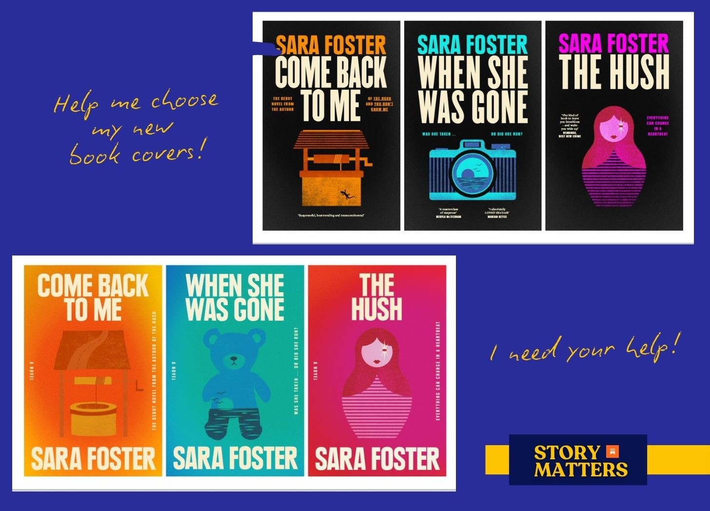
Hello dear readers,
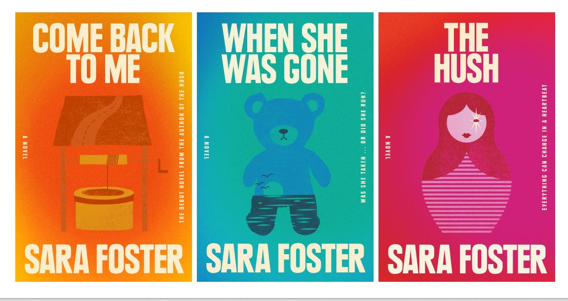
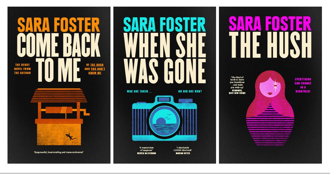
This is a very short message from me because I would dearly love your help. I’m currently rebranding my book covers because I’m going to have a go at publishing them myself in the UK, where my stories haven’t really been discovered yet. As my newsletter subscribers (some of you for over a decade!), you’re the readers who know my work the best, and I would love your thoughts on these. I’ve been working with renowned cover designer George Saad and he’s come up with some brilliant concepts for me. So the question is: which one do you love the best (you can vote in the poll) and would you be drawn to these covers? Please comment away and give me your reasons, so I can fully understand your point of view!
Some extra notes: the teddy bear is an earlier draft of cover for When She Was Gone, so the image will be a camera (with the scene inside the lens likely to be altered too).
OPTION ONE:
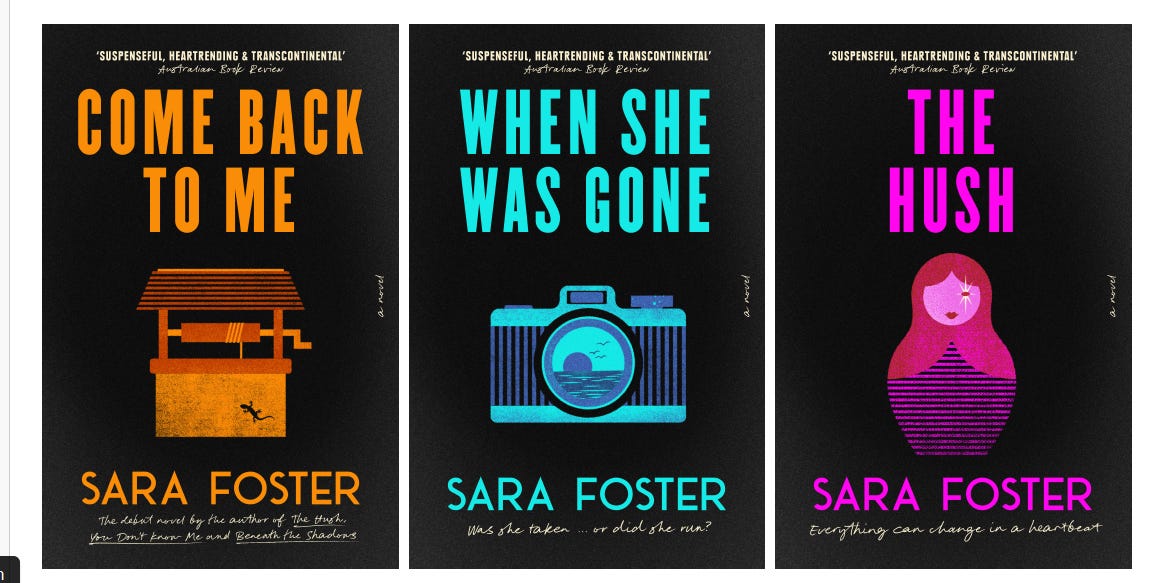
OPTION TWO:
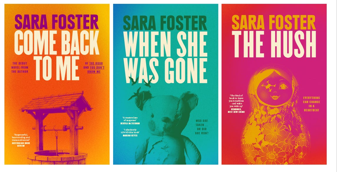
OPTION THREE:
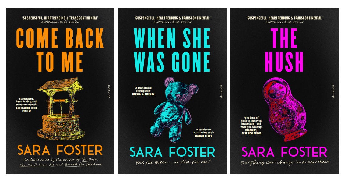
OPTION FOUR:
OPTION FIVE:
The poll is open until the weekend, so please cast your votes, and thank you for taking the time to help me out!
I think that Option 5 is most compelling with Option 1 in second place for me. I love the vibe of Option 3, but think it leans more toward a promise of explicit horror rather than the more nuanced dark notes a la Du Maurier's Rebecca. And also, yay for reaching this stage! I can't wait to buy a new set for my bookshelf!! :)
I like option 2, the graphic images are a bit too plain to my eye and yes 3 says horror. Colours on all options are great!